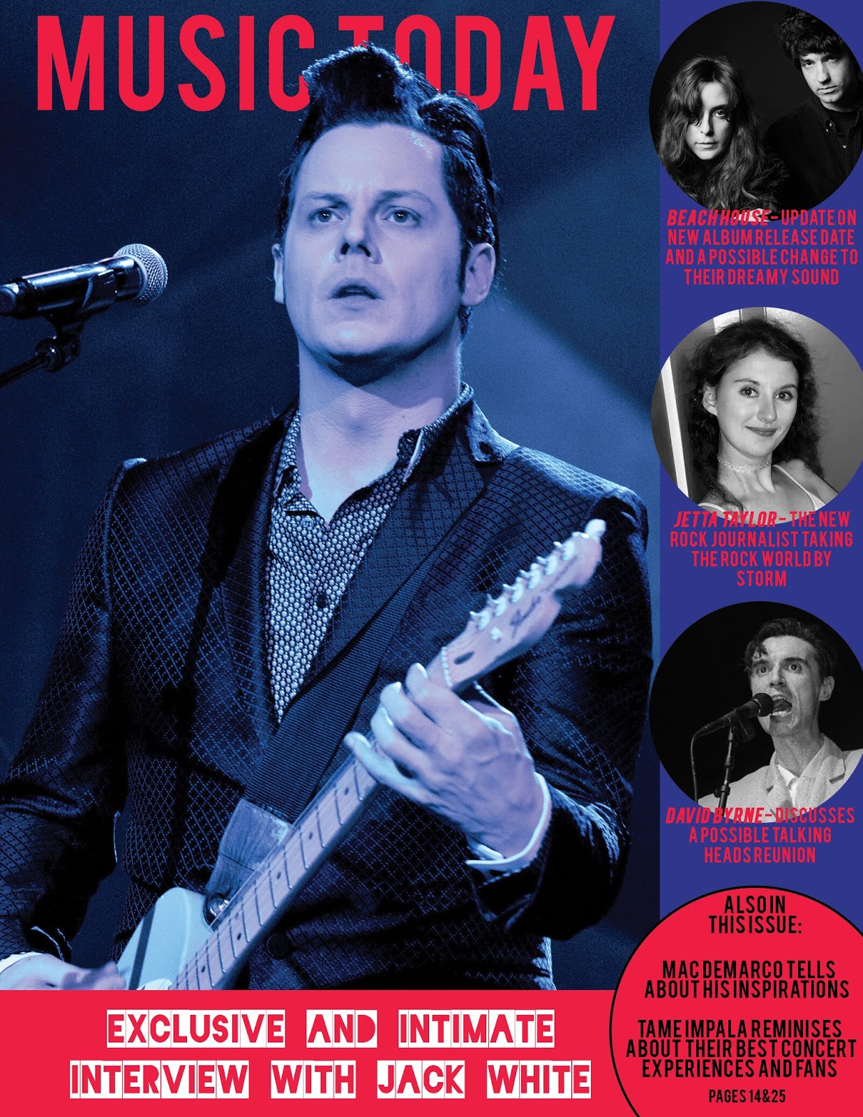
Above is my portfolio. It was a difficult assignment for me because I felt InDesign was difficult to use. It is nice to have a portfolio though!
Wednesday, December 14, 2016
Wednesday, November 30, 2016
Animation
Above is my animation. I used the song Master of None by Beach House as my inspiration. I had some technical trouble making this video, but overall it was enjoyable to create!
Sunday, November 13, 2016
Collage
Above is my collage. I was inspired by one of my favorite songs called Master of None by Beach House. I interpret the message of that song as no matter how beautiful you are, you cannot balance drugs, wealth, or aging and still be happy. You can go to all the parties, but you will only achieve a fleeting happiness before it all goes up in smoke.
Thursday, November 3, 2016
Magazine Cover
Above is my magazine cover. I chose to do a music themed magazine as music is something I'm passionate about, but I can never find a music magazine that writes about the music I'm into. I very much enjoyed using Photoshop to create this assignment.
Tuesday, October 25, 2016
Photoshop
Above is my photoshop assignment of somewhere I've never been. Accepting an Oscar with Marlon Brando is definitely somewhere I've never been but would like to!
Monday, October 24, 2016
HTML Logo
Above is the screenshot of the Beats logo I created using HTML. Below is the link to view the image on the web,
file:///Volumes/Student%20Server/Fall%202016/ART/ART%20210%20A%20-%20Foundations%20Digital%20Media%20-%20Corrigan/Student%20Work/Jetta%20Taylor/BeatsLogo.html
Below is the code I used to create this image as well as the graphed image.
<!DOCTYPE HTML>
<html>
<head>
<script>
window.onload = function() {
var canvas = document.getElementById("myCanvas");
var context = canvas.getContext("2d");
////////////////////////////////////// start below this line ˇˇˇˇˇˇˇˇˇˇ
context.beginPath();
context.arc(300, 300, 300, 0, 2*Math.PI, true);
context.fillStyle = 'rgb(255, 0, 0)';
context.fill();
context.beginPath();
context.arc(300, 300, 150, 0, 2*Math.PI, true);
context.fillStyle = 'rgb(255, 255, 255)';
context.fill();
context.beginPath();
context.rect(150.3, 9, 75, 310);
context.lineWidth = '10';
context.fillStyle = 'white';
context.fill();
context.beginPath();
context.arc(300, 300, 87.5, 0, 2*Math.PI, true);
context.fillStyle = 'rgb(255, 0, 0)';
context.fill();
////////////////////////////////////// end above this line ˆˆˆˆˆˆˆˆˆˆˆˆˆˆˆ
};
</script>
</head>
<body>
<canvas id="myCanvas" width="800" height="600"></canvas>
</body>
</html>
Monday, October 10, 2016
Vector Illustration
Above is my vector illustration. I chose to do my illustration using a reference image of my mom when she was young. This was quite a time consuming process, and I'm not sure if saving it as a GIF was the highest-quality option. However, I quite like how it tuned out. Thanks for the pic, mom! Looking good.
Tuesday, September 27, 2016
Monday, September 19, 2016
Calligram
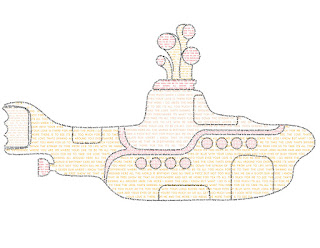
Above is my calligram, which is the yellow submarine from the Beatle's movie Yellow Submarine. I chose to compose it using lyrics from my two favorite songs from the movie, "Baby You're a Rich Man" and "It's All Too Much". I'm really proud of this project, it was very time consuming but I think it was all worth it!
Tuesday, September 13, 2016
Assignment 2: Logo Critique
Compare and contrast 2 icons or symbol-driven logos of two different companies who sell similar products, or sell products to a similar target audience. For example, McDonalds' golden arches versus Burger King's burger-shaped logo, or Firefox vs. Chrome vs. Opera vs. Internet Explorer, or Maya vs 3D Studio Max, or Nintendo vs. Sega vs. Sony vs. Microsoft, or Facebook vs. Twitter, Tumblr vs Instagram, etc. Choose two companies, post their icons on your blog along with your analysis on their effectiveness and critique of their design choices. Which one do you feel is more successful? Why?
Tuesday, August 30, 2016
Assignment 1
Assignment 1 (Due Class 2 - 8/31): Blog
Go to blogger.com and create your own blog for this class. Make one post on your blog that introduces you, describes who you are, what you do and what you expect from this class.
A Bit About Me:
My name is Jetta Taylor. I am originally from Princeville, Illinois - a tiny town in central Illinois. When I say tiny I mean that there were 56 kids in my graduating high school class. After graduation I set my sights on the big city and getting as far away from Princeville as I could. I moved to Portland, Oregon and began studying at Portland State University, where I majored in Advertising. While there I volunteered at the student-run radio station, KPSU, and worked for the Student Health and Counseling Center organizing articles for an online health promotion magazine. After my freshman year I decided I wanted to be closer to family, so I moved to Florida where my dad recently relocated, and now here I am at the University of Tampa majoring in Advertising and Public Relations.
Class Expectations:
I am excited to be taking Art 210! I expect to be proficient in Adobe Photoshop and Illustrator by the end of this semester. I also expect to gain some more artistic abilities and skills that I do not have now. I love art and have taken some art classes in the past, so I know there are always many new things to learn. I love finding a new way to look at things, a new way to really see things, and to me that is what art is all about.
A photo of me expertly taken by my dad on his cell phone
Subscribe to:
Comments (Atom)


