Tuesday, September 27, 2016

Tuesday, September 20, 2016

Monday, September 19, 2016

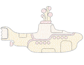
Calligram


Above is my calligram, which is the yellow submarine from the Beatle's movie Yellow Submarine. I chose to compose it using lyrics from my two favorite songs from the movie, "Baby You're a Rich Man" and "It's All Too Much". I'm really proud of this project, it was very time consuming but I think it was all worth it!

Tuesday, September 13, 2016

Assignment 2: Logo Critique

Compare and contrast 2 icons or symbol-driven logos of two different companies who sell similar products, or sell products to a similar target audience.  For example, McDonalds' golden arches versus Burger King's burger-shaped logo, or Firefox vs. Chrome vs. Opera vs. Internet Explorer, or Maya vs 3D Studio Max, or Nintendo vs. Sega vs. Sony vs. Microsoft, or Facebook vs. Twitter, Tumblr vs Instagram, etc.  Choose two companies, post their icons on your blog along with your analysis on their effectiveness and critique of their design choices.  Which one do you feel is more successful?  Why?


Above are the app logos for American Airlines and Allegiant Airlines, respectively. I chose these icons because I fly frequently, and these apps are always on my phone and they are right next to each other. The logos are trying to reach flyers as their target audience, and I feel the American Airlines logo appeals more to the sophisticated first class flyer, whereas the allegiant is targeting the thrifty flyer. I feel each logo is reaching and appealing to their target audience. I think the American Airlines logo is successful because it is sleek, and uses no text. This shows that they are confident in their brand, and that it targets people who fly so often that they don't need text to explain which airline it is, because they can recognize the logo. Allegiant's on the other hand is mostly text, so that new flyers know immediately which airline it is, because they are probably new and aren't familiar with airlines. I like both color choices, I think they both work nicely and are appealing. I am more partial to the sleek styling of the American Airlines logo. In summary, I think the American Airlines logo is the winner because of the superior styling and confidence in their brand recognition.